— Brand, visual design and product direction
Aurora Compass
A free aurora and space weather app for iOS and Android, simple for beginners and detailed enough for chasers.
4.9 out of 5on App Store and Google Playauroracompass.com
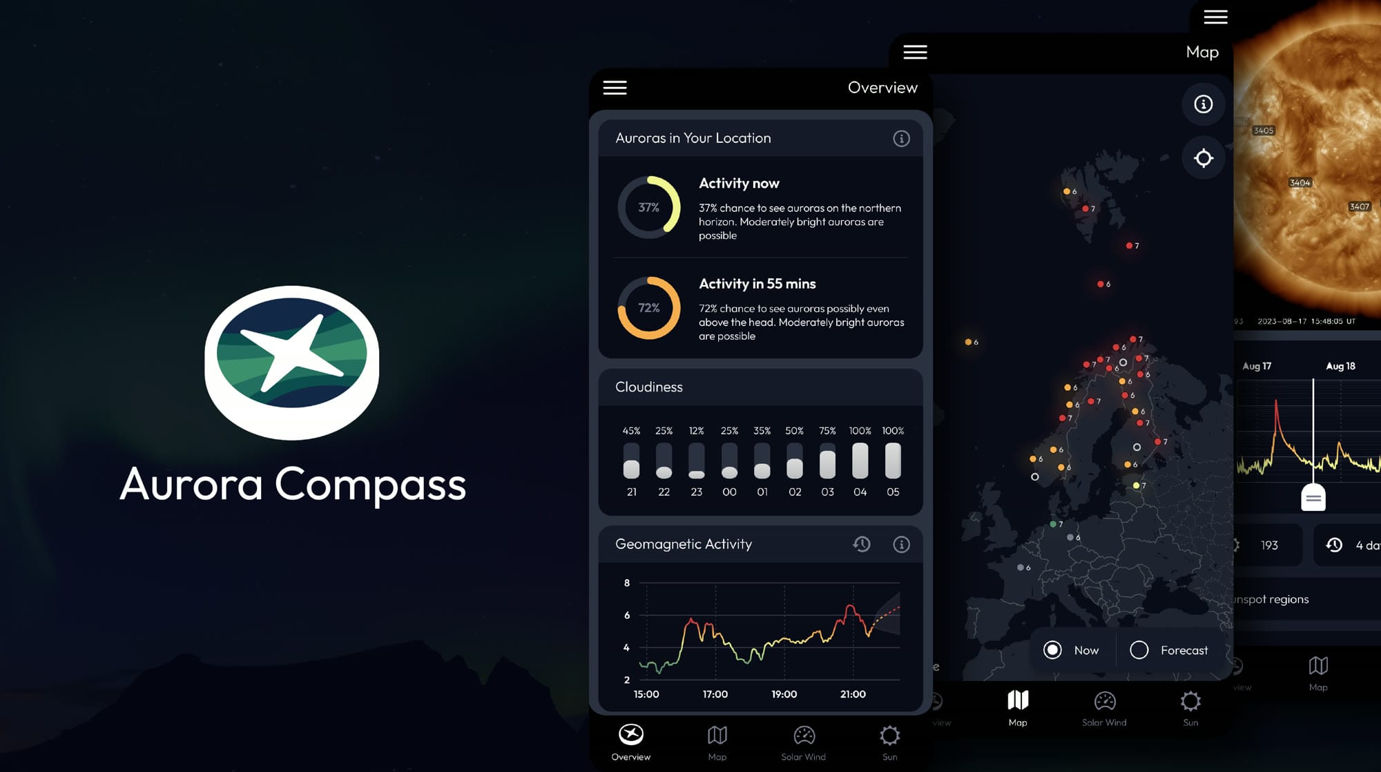
Aurora Compass answers one question: should I go outside tonight? It gives the current and forecast probability of seeing auroras at your own location, weighed against the cloud forecast, and sends an alert when the two line up. Behind the short answer sits the full data: near real-time geomagnetic activity from over a hundred magnetometers, an aurora map with shared observations, a solar image player with x-ray charts and active regions, the WSA-Enlil solar wind forecast, Kp forecasts, and moon and darkness tools.
My part was the look and the direction. The brand and the logo, the screens and the way the data is drawn, and the calls about what belongs on the overview and what is a tab away. The aim is a clean, clear app that serves a first night out as well as a chaser who wants every chart. Colour carries the data, from green through red, and there are several palettes to choose from, one of them for red-green colour blindness.
The best thing about it is that it is free: no ads, no paywall, nothing held back. The map is shared, so anyone can post what they are seeing, with a photograph, and see what others have caught tonight.